ggplot your missing data
Visualising missing data is important when analysing a dataset. I wanted to make a plot of the presence/absence in a dataset. One package, Amelia provides a function to do this, but I don’t like the way it looks. So I made a ggplot version of what it did.
Let’s make a dataset using the awesome wakefield package, and add random missingness.
library(dplyr)
library(wakefield)
df <-
  r_data_frame(
  n = 30,
  id,
  race,
  age,
  sex,
  hour,
  iq,
  height,
  died,
  Scoring = rnorm,
  Smoker = valid
  ) %>%
  r_na(prob=.4)
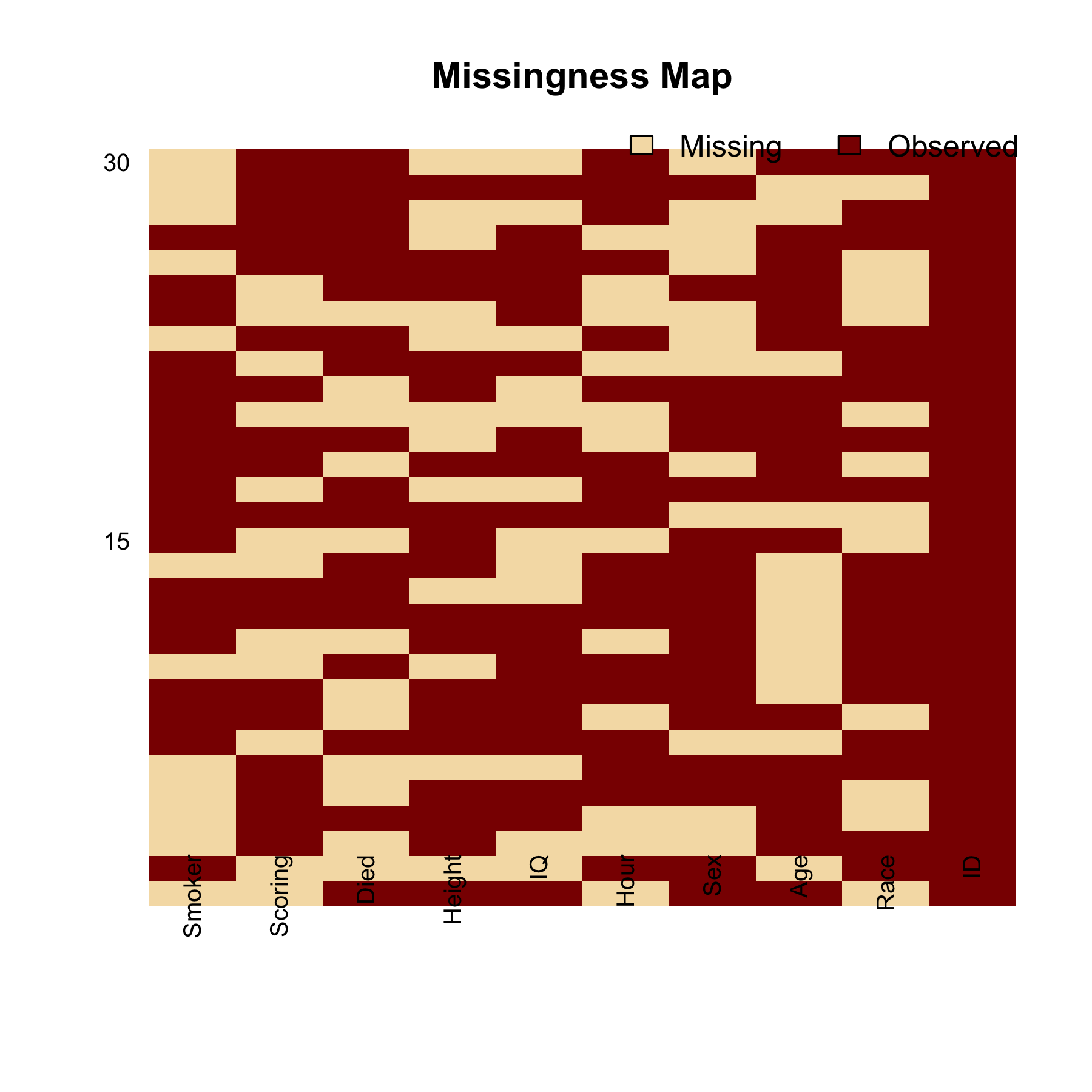
This is what the Amelia package produces by default:
library(Amelia)

missmap(df)

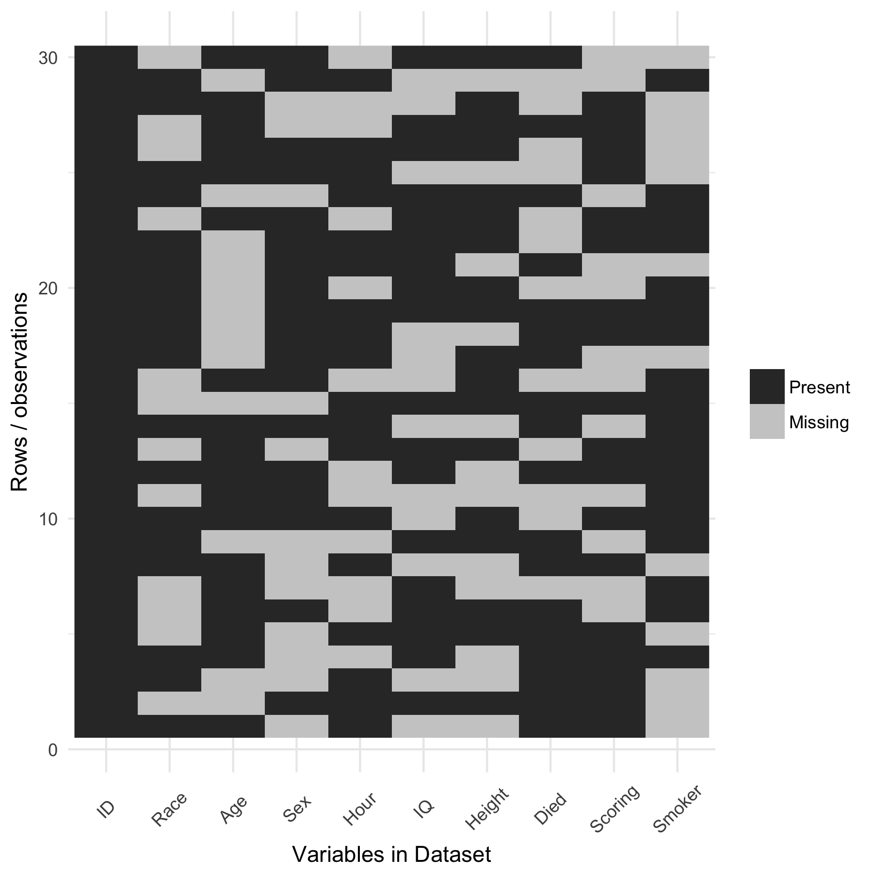
And let’s explore the missing data using my own ggplot function:
# A function that plots missingness
# requires `reshape2`

library(reshape2)
library(ggplot2)

ggplot_missing <- function(x){

  x %>%
    is.na %>%
    melt %>%
    ggplot(data = .,
           aes(x = Var2,
               y = Var1)) +
    geom_raster(aes(fill = value)) +
    scale_fill_grey(name = "",
                    labels = c("Present","Missing")) +
    theme_minimal() +
    theme(axis.text.x  = element_text(angle=45, vjust=0.5)) +
    labs(x = "Variables in Dataset",
         y = "Rows / observations")
}
Let’s test it out
ggplot_missing(df)

It’s much cleaner, and easier to interpret.
This function, and others, is available in the neato package, where I store a bunch of functions I think are neat.
Quick note - there used to be a function, missing.pattern.plot that you can see here in the package mi. However, it doesn’t appear to exist anymore. This is a shame, as it was a really nifty plot that clustered the groups of missingness. My friend and colleague, Sam Clifford heard me complaining about this and wrote some code that does just that - I shall share this soon, it will likely be added to the neato repository.
Thoughts? Write them below.